How to make a bar chart
- Pick a chart. In step 1 choose a 3D chart — Regular, Break into cubes or Cylinder — or a flat (2D) one: Professional, with upright bars, or Horizontal, with the bars side to side. You can change it later in step 3, and your data stays.
- Add your data. Give the chart a title, then put the names in the first column (months, products, places) and the numbers in the next. Add a column of numbers for each group you want to compare. Type over the example, paste cells from Excel or Google Sheets, or open an .xlsx, .xls or .csv file. The chart changes as you type.
- Design and download. In step 3 choose the colors, the background, the font and the labels, set the scale and the grid lines, and turn a 3D chart by dragging it. Press Edit under the chart to move the title, the legend or any label. Then download the chart as a PNG picture or an SVG file, or copy it straight into Word, PowerPoint or Google Slides.
3D or 2D?
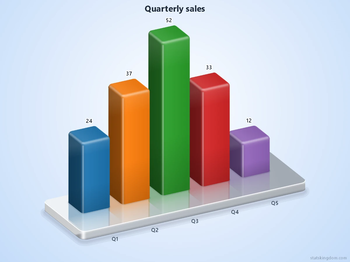
- 3D charts catch the eye in a presentation, a poster or a social post: glossy columns on a base that reflects them, turned to the angle you like. Round their top edges, make them glass or cylinders, or break each column into cubes. Reflection % sets how much the base reflects them, from 0 (none) to 100 (like a mirror).
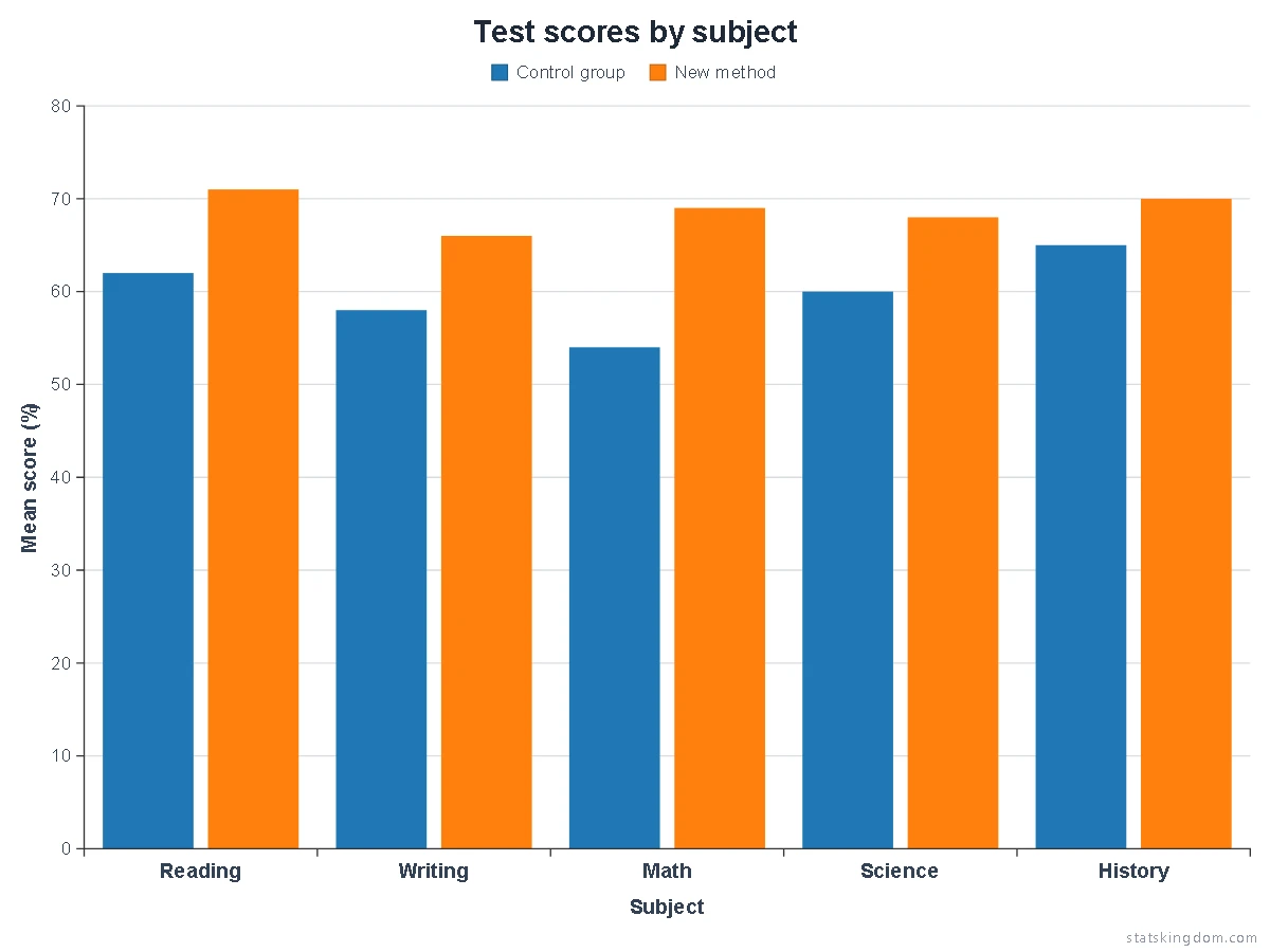
- Professional (2D) is the plain chart a report, a thesis or a journal article needs: flat bars with square corners on a white background, a value scale with grid lines, and axis titles taken from your table. It starts in Arial, with one color for each column of numbers and no numbers on the bars, because the scale gives the values.
- Horizontal (2D) is the same chart turned on its side. The names sit to the left of the bars, so long names such as products, countries or survey answers stay easy to read.
Axes and grid lines
The 2D charts always have a scale. A 3D chart gets one when you tick Scale on a back wall: lines on a wall behind the columns, with the numbers at its end. These options are under Axes & grid in step 3.
- Value range: leave Min, Max and Step empty and the scale starts at 0 and takes round steps (1, 2, 2.5 or 5 times a power of ten). Type your own to fix them.
- Axis titles come from your table: the header of the names column titles the category axis, and with one column of numbers its header titles the value axis. Type your own, or hide them; each has its own size and color.
- Lines: value lines (color, width, solid, dashed or dotted), half-step lines between them, lines between the categories, the axis lines with tick marks outside or inside, and a frame round the plot.
- Text before or after the numbers, such as “$” or “%”, goes on every number of the scale and of the bars.
Fonts and black-and-white printing
- Font: six fonts that come with Windows and Office — Segoe UI, Arial, Calibri, Times New Roman, Georgia and Cambria. A computer or phone without one shows a close match instead. Many journals ask for Arial (or Helvetica) in figures; Times New Roman or Cambria match a text set in a serif font.
- Fill (2D): Color, Color + hatch (lines inside the bars) or Black and white (white bars with black lines). Each column of numbers gets its own hatch — diagonal, back diagonal, cross, horizontal, vertical, grid or dots — and the legend shows the same, so the bars stay apart in a grey printout or a photocopy.
- Empty bars (2D) draw only the line round each bar, in its own color. Outline adds a darker or a black line round full bars.
Moving things on the chart
Press Edit under the chart, then drag the title, the legend, a number, a name, an axis title or the watermark to where you want it. Drag a bar or the base to move the whole chart — its bars, numbers, names and scale together. To make the chart bigger or smaller, click it and drag one of the small squares on the corners of its dashed box: that sets Chart size %, and the text keeps its size. A click chooses a thing and a dashed box shows it; the arrow keys then move it a little (hold Shift for bigger steps), and Delete puts it back. Undo takes back the last move or resize, and Reset positions puts everything back. A number moves with its column when you turn a 3D chart, and your moves stay when you change the colors or other options. Press Done when you have finished: dragging a 3D chart then turns it again.
Chart size % (under Chart) sets how big the chart is in the picture: 80 is its usual size. Make it smaller to leave room to move it, or bigger — up to 100 — to let it fill the room of the title and the legend once you have moved them. The legend can also stand beside the chart: choose Right or Left under Legend.
Tips for a good-looking chart
- One color per column makes a few categories stand out, like in a presentation (tick A different color for each column). With two or more columns of numbers, each column of numbers keeps one color, and a legend names them.
- Stacked: with two or more columns of numbers, tick Stacked to pile each row's numbers into one bar, in the order of the table's columns, instead of side by side. Each part shows its own number when there is room, and the total sits at the end of the pile. Negative numbers pile downwards.
- The angle: a small Turn (20–35°) and Tilt (20–30°) show the front of each 3D column and still keep the heights easy to compare. A Turn of 0 looks at the chart straight on.
- Backgrounds: a plain color, a pattern such as graph paper, a notebook page, a honeycomb or a chalkboard, or a fun pattern such as hearts, cats, stars or pandas. The patterns are drawn light, nothing is drawn right behind the title or the legend, and every word gets a thin outline in the color of the paper, so it stays easy to read. On the Dark background, the chalkboard and the blueprint the text turns white. The colored backgrounds (Soft grey, Soft blue, Cream, Lavender and Dark) can also be shaded in seven ways under Shading: a glow, a spotlight, a vignette, light from the top or the bottom, a diagonal, or flat. The background is part of the PNG and SVG files.
- Numbers on the bars show each exact value. If the bars are too narrow for them, the page hides them and says so.
- Cubes: every cube stands for the same round amount, such as 10, so the heights stay exact and the cubes can be counted. A column ends where its value ends, so its top cube may be only part of a cube.
- Negative values hang below the base of a 3D chart, from its front edge, on the same scale as the columns standing on it, so a −10 is as long as a +10. In 2D they go below the zero line, or to its left on a horizontal chart.
Download and use your chart
- PNG is a picture, saved at twice the size you see so it stays sharp. With the background set to None it is see-through around the chart.
- SVG is a vector file: it stays crisp at any size and opens in programs such as Inkscape, Illustrator or PowerPoint, where it looks the same as here. It is the best choice for a figure in a paper.
- Copy image puts the chart on your clipboard, ready to paste.
- Your data stays on your computer. The chart is drawn in your browser, and your last chart is remembered in this browser only: press Last run in step 2 to bring it back.
Frequently asked questions
Is this bar chart maker free? Do I need an account?
It is free, and there is no sign-up or login. Pick a chart and start typing your data.
Which chart should I use in a report or a scientific paper?
The Professional (2D) chart: flat bars on a scale with axis titles, on a plain white background, in Arial or in a font that matches your text. Choose Black and white under Fill if the paper is printed without color, and download the chart as an SVG so it stays sharp at any size.
How do I compare groups side by side, or stack them?
Add a column of numbers for each group. The bars of one row then stand side by side, each group in its own color, and a legend names the groups. Tick Stacked to pile them into one bar instead.
Can I move the title, the legend, a label or the chart itself?
Yes. Press Edit under the chart and drag it where you want it; drag a bar to move the whole chart. Make the chart smaller with Chart size % to give it room. Reset positions puts everything back where the page places it.
Why is there a small “statskingdom.com” on my chart, and can I remove it?
By default a small statskingdom.com mark sits in the bottom corner of the chart, and it is part of the downloaded image, like a photo credit. It is your choice: in step 3, under Labels, type your own name or company in the Watermark box, or clear the box for no watermark.
If you like the page, please share or like it. Questions and suggestions are welcome at [email protected]. No reply? Check your spam folder.